Company:
Fundraise Up
Year:
2024 – Present
Type:
B2B
Overview
A comprehensive overhaul of the core fundraising management product. The project included building a new design system, a complete interface redesign (Dashboard Redesign 2025), and reimagining the information architecture to meet Enterprise client requirements.

Before redesign
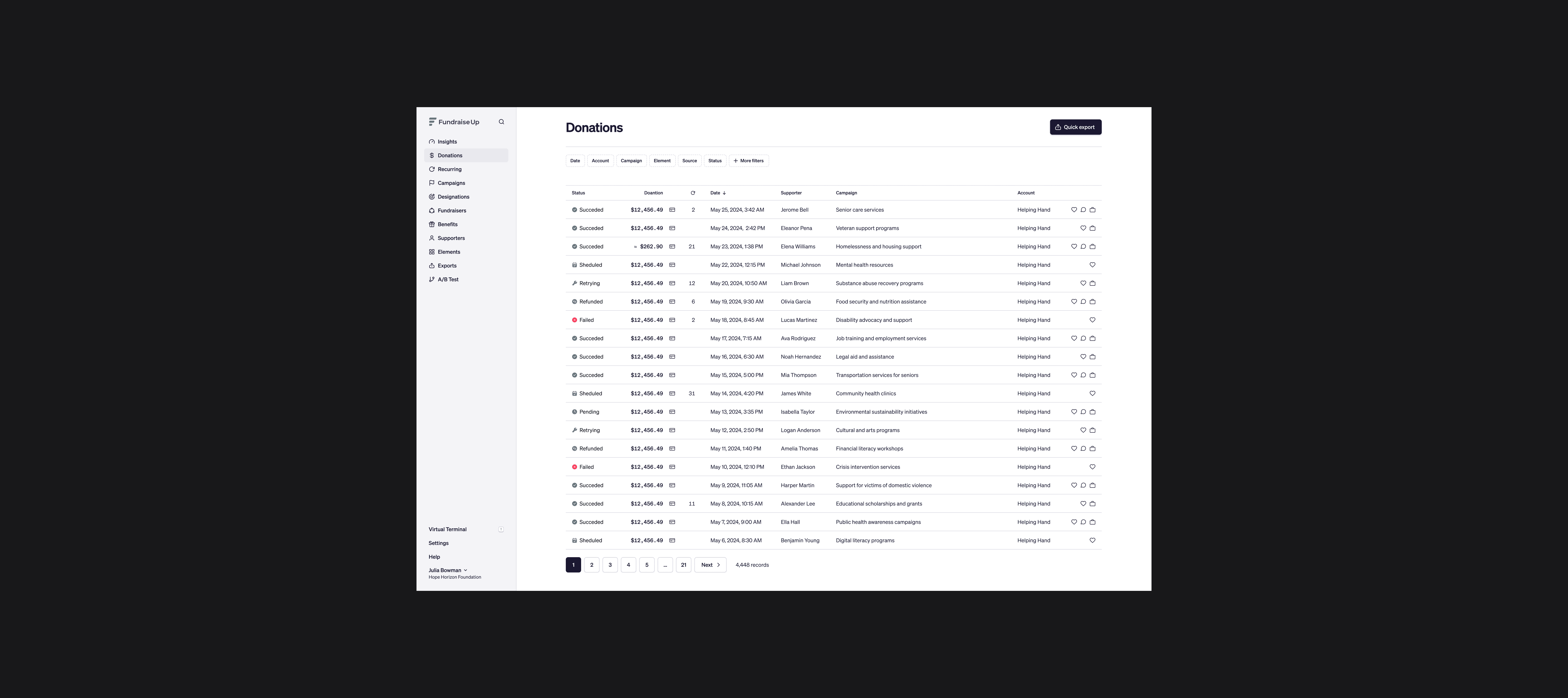
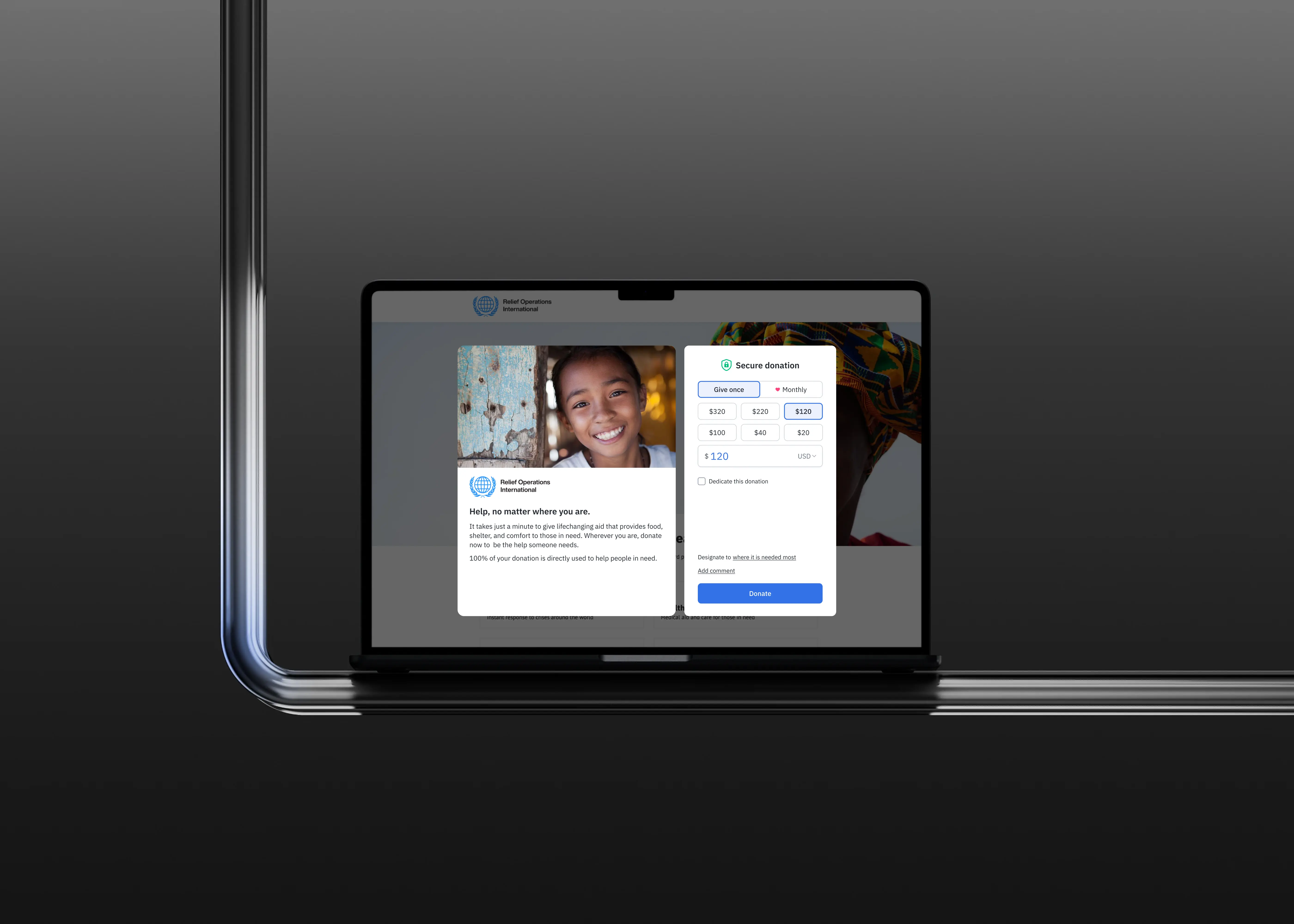
After redesign
Challange
The legacy dashboard interface had evolved organically over 5 years and no longer met modern standards for scalability and consistency:
Outdated UI: The visual style did not match the sophistication of a product used by global nonprofits like UNICEF and Red Cross.
Navigation Complexity: As functionality grew, the menu became cluttered, causing users to lose context when managing settings.
Lack of System: Component duplication slowed down development and made maintaining consistency difficult.
My Role
As a Senior Product Designer, I played a key role in the transition to the new product version:
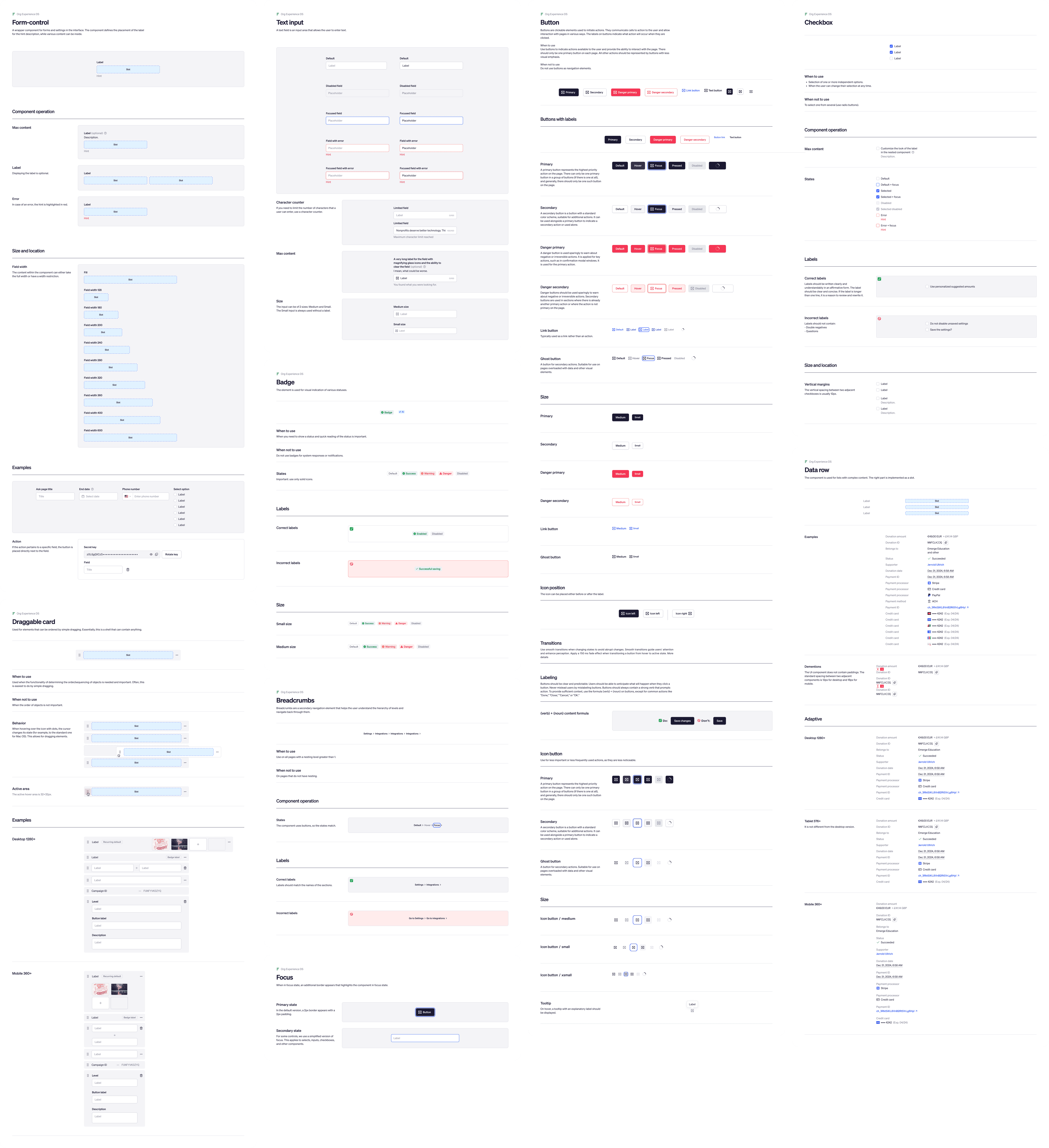
Design System: Contributed to the creation and systematization of components (Design System 2.0) — from typography and colors to complex patterns (filters, tables).
Redesign 2025: Designed key sections in the new style: Campaign Editor, Settings, and Audit Log.
Enterprise Features: Designed the UX for complex technical sections (Security & Access Control, Audit Log), balancing security with ease of use.

Outcome
We built a foundation for the product's growth for the next 3-5 years:
Customer Satisfaction: The focus on usability and modern UI contributed to a CSAT increase to 95.8% (+3.8%).
Modern UX/UI: Completely refreshed the visual language (typography, color palette, interface density), elevating the perceived quality of the product. The new left-sidebar layout improved navigation and freed up space for content.
Enterprise Compliance: The implementation of Audit Log and Security Dashboard settings resolved critical requirements for the Enterprise segment, increasing trust among large organizations.
Design System Adoption: Component standardization (tables, modals, buttons) accelerated the development of new features and reduced UI bugs.
Process of Work
Work was conducted systematically and iteratively:
Audit & Systematization: Conducted an audit of the old interface, identified inconsistencies, and created a unified component library in Figma.
Layout & Navigation: Reimagined the navigation structure, moving the menu to the left for better scalability.
Specific Features: For sections like the Audit Log, I performed detailed use case analysis (who views logs, when, and why) to make complex technical information readable and actionable.